During this exercise I was reminded of the lifetimes of dedication
which went into guiding our understanding of the world and how humans interact
with it.
To dismiss the systems created by the great minds referred to in the course literature would be foolish. These systems are there to provide balance, harmony and pleasure.
Understanding the rules of aesthetics is crucial for designers, sticking to them is not. A designer might want to provide tension where balance and harmony would not work.
Principles in aesthetic design are executed universally and
thus I believe beauty is universally appreciated. There are of course designs
which sit outside these principles, which some may consider ugly or unpleasing whilst
others will gain interest, pleasure and intrigue in.
Looking into what creates atmosphere in buildings, I learned
our culture, background and experiences influence our perception. I believe
these foundations also affect what we believe to be ugly or beautiful, when the
rules are not met.
Beton brut, I can appreciate looks ugly, it is grey, raw and unfinished but understanding the value in ‘truth to materials’ I now appreciate the rawness tells a story, I can see how it was made, what it was made of and it’s imperfections – all of which there is beauty in.
My process for completing assignment two was initially to read the assignment outline, then read and read again to be sure I fully understood what I was to do. For some clarity I contacted my tutor about work which could be included.
Secondly, I undertook research into visual presentations and how best to present the message I wished to convey to my audience. My audience I considered to be my tutor, students and those who are interested in the history of Nottingham and or it’s Lace Market district and those interested in the design decisions behind the Nottingham Contemporary.
Further to this I wanted to display a variety of the work I had completed/gathered, whilst ensuring it related to relevant information and provide a narrative.
Lastly, I considered my design which I wanted to link to the building. This took some working until I finally decided on my final piece. This is based on colours of the Contemporary’s exterior, the angled walls, which I have referred to throughout my work on the Contemporary and I framed most of the images – like pictures in an art gallery.
I enjoyed the process, particularly as I was learning yet another skill – effective ways to present. Without feedback I am not yet sure I achieved this yet but it was helpful to consider it and play with different ideas. I feel I’m a little limited as currently I only have PowerPoint available, I expect it’s possible to create better quality presentations with a more sophisticated design package? I have however signed up for an adobe creative cloud course in July at which point I will purchase the software too.
The process has been valuable in furthering my knowledge and skills in; visual presentation, design styles and decision making – considering the most valuable and relevant visual and written information to provide.
One thing I’ve found disappointing about the process is that there is no assessment criteria yet available to check against, even though the assessment guidance tells students this is what we should do before submitting work to tutors? It worries me there will be key criteria which I have not quite hit the mark on.
I am pleased with the outcome but also feel it is a little basic and that it’s possible to achieve something much slicker and more minimal. This will probably take better software and more experience and confidence in design and presentation skills. When I was researching presentations, I enjoyed and admired those I viewed which were minimal yet conveyed their message well. I did not feel confident enough to leave too much information or images out, in order that I display a variety of work.
With continuing learning, skills and knowledge I hope one day to achieve the look and quality of some of the presentations I viewed – and create something minimal while effective.
I expect to incorporate this process in continuing practice
in may ways; creating mood boards, presenting design ideas to clients and creating
a portfolio of work.
If vernacular architecture is to do with issues around sustainability both environmental and economical – and to produce contemporary, innovative buildings that explore and borrow methods, materials and techniques from the past I would suggest that a CobBauge building, a material which I researched for exercise 2.3 is a good example of vernacular architecture.
Fig 1.
CobBauge brings the natural material cob up-to-date ensuring it meets building regulations and environmental standards while being a sustainable economical product, sourced from materials in the area the building is to be built on.
Further examples of vernacular architecture are those shown below by Birdsye Design. Birdseye Design are an American architectural firm which states that it has an ‘architectural language which draws from region, heritage and context’ (Birdseye, 2017). This would suggest a vernacular language and with their strong commitment to woodworking and artisan work would suggest a connection to past skills and methods.
Their projects link to the regions historic architectural styles.
Fig 2.
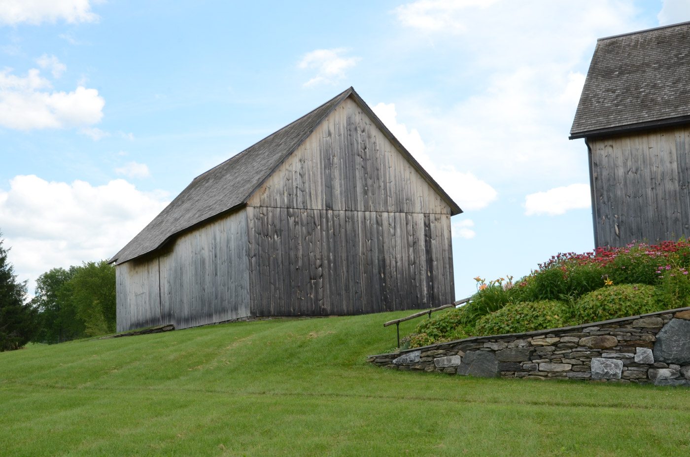
Dorset Mountain Home is a contemporary building which draws
on the steep gable barn roofs of Vermont, where the house is situated.
Below is Board + Batten Guest House named after the traditional board and batten exterior panelling of homes in this region, also in Vermont.
Fig 3.
Further examples are contemporary homes in the highlands and islands of Scotland which are being built with respect to the traditional style of this region. In areas like these there is a close relationship between people and the environment and the homes are designed to fit in and not take from or jar with the environment around them.
Fig 4.
Architectural firms such as Dualchas and Rural Design are
ensuring homes are being built which consider ‘design elements like social,
economic and environmental sustainability’ (The Culture Trip, 2019)
Fig 5.
Fig 6.
Black house on the Isle of Skye is designed by architects Rural Design. Black House is built into a hollow between two drumlins, this shields it from the high winds on the island, whilst not detracting from views in the area.
The buildings form and exterior black cladding is inspired from the traditional agricultural buildings which are dotted around the landscape. The building is designed to be sturdy and efficient.
Fig. 7. Traditional agricultural builindg
The architects state that ‘the house is truly a black house, not only by it’s colour but by it’s very spirit. It draws parallels to the can-do attitude of the original occupants of blackhouses, heroically self-built using materials and skills to create a shelter for the family’ (Rural Design, 2016). I believe this epitomises modern vernacular, built with regard to the local landscape, materials, environment and people, whilst being economical and sustainable.
Vernacular Architecture in my village
I live in Oxton, a rural Nottinghamshire Village which was first mentioned in the Doomsday book.
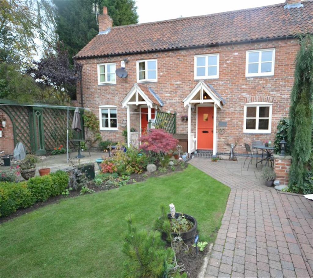
There are a variety of buildings of different ages and styles in the village but the traditional vernacular architecture is very much red brick buildings with pantiled roofs. Such as the 18th Century Manor House which also displays gothic glazing bars.
Fig 8.
The Church of St. Peters and St. Pauls however dates back from the 12th century with restoration taking place in 1898. It is a listed building with its listing stating it is built of Ashlar dressed rubble with a slate roof. Ashler being a finely cut stone, usually in a cuboid shape.
Fig 9.
As it is a rural village many of the buildings are farm buildings, most of which have been converted into homes, again displaying the traditional red brick and pantiled roofs.
Fig 10.
As the village has grown and modernised the building style, whether grand or affordable housing has continued to be sympathetic to the traditional style of building materials, with some modern buildings continuing to be designed with Georgian style windows.
Fig 8. (2011) [photograph] Murray-Rust, A. (n.d.). The Manor House (C) Alan Murray-Rust. Geograph.org.uk. At: https://www.geograph.org.uk/photo/1629233 (Accessed 29.03.19)
Ruraldesign.co.uk. (2016). Rural Design Architects – Isle of Skye and the Highlands and Islands of Scotland. [online] Available at: https://www.ruraldesign.co.uk/ (Accessed on 29.03.19)
Williams.gen.nz. (2001). A Brief History of Hosiery Manufacture and Lacemaking in Nottingham.. [online] At: http://www.williams.gen.nz/hosiery.html (Accessed on 20.03.19)
The Nottingham Contemporary’s entrance sits on High Pavement in the conservation area of the Lace Market in Nottingham City Centre.
The Nottingham Contemporary is built on a cliff, with entrances to the building on three levels. The main entrance sits on High Pavement ground level, the level on which the galleries are situated on.
The public can enter and exit at two points in the building, High Pavement, east facing and through the café bar, south facing on the mezzanine level, which exits onto the lower yard. Also to the south in the basement level which is situated at the end of cliff road is the vehicle and works entrance. This entrance provides space for lorries to back into the building to unload and load.
The buildings main purpose is an exhibition space for contemporary art, which is displayed in galleries 1-4. In other areas of the building there are workshop spaces, offices and an events space which can provide, music, theatre and cinema.
The space within the galleries provides a good expanse of height and width to accommodate a variety of exhibitions.
Approximate dimensions
Existing buildings adjacent to the sight, north facing
There are a number of buildings surrounding the Nottingham Contemporary. The north face of the building has a large expanse of open space as it looks out onto Weekday cross. The buildings facing the Contemporary on weekday cross are mainly cafe’s and restaurants, which are at an angle to this face of the building and look out onto gallery 4’s window. The offices to the west sit across and slightly back from the wide expanse of Middle Hill road, although they overlook the west side of the Contemporary there are no windows on this side of the building.
Existing buildings adjacent to the sight, north east facing
To the north east of the main entrance, sitting along High Pavement, is a long row of converted historical buildings, which consist of mainly restaurants, cafe’s and bars. These buildings have a view onto the north window and entrance and upper yard window. These buildings have little influence over internal views but link the building to the lace market to which it’s structure is influenced.
Existing buildings adjacent to the sight east facing
To the east lies the imposing converted Unitarian Church, which is now a restaurant/bar. It has high level stained windows, which do not provide views onto the Contemporary and its entrance sits back from the road and from the boundary of the Nottingham Contemporary upper yard. The upper yard area and parts of Garnet Hill steps – with views into the contemporary’s large landing window – can however be viewed from the outside seating areas of the church.
Internal sightlines
The sunpath allows the Contemporary’s main entrance to have early sun to after midday. Before, during and after midday the best of the sun is focused on the lower yard, where the café seating spills out onto when the weather permits. The north and east facing buildings are not too close to block the sun from the buildings windows and the south facing windows on the café and project area have no buildings overlooking the Contemporary.
The main materials in The Nottingham Contemporary galleries are; wooden floors, plaster walls, glass and the materials from which the ceiling/window structure is made from – what material this is I am not entirely sure?
Wooden Floors
The wooden floors in the Nottingham Contemporary provide a very mellow element to the galleries. The tones in the wood are soft natural tones of yellow, orange and brown, with varying shades of grey in the grain and between the boards. The floors are used throughout the galleries which provides a flow through the building.
The wood appears flat and smooth but it is far from one dimensional. The shape of the boards themselves provide pattern and direction. Looking more closely the differing grain of every board provides a natural beauty and texture.
I am not certain what type of wood it is but would take a guess at oak and also that it is a solid wooden floor. Solid wooden floors provide the best sound absorption, this being another reason the floor appears mellow to me. As I sat at the entrance to the galleries I watched and listened as people entered, which acoustically was soft and gentle underfoot.
In areas where the floor has clearly had greater footfall the boards look greyer as the grains in the wood appear to merge together and become worn.
Plastered Walls
From a distance the plastered walls appear to be flat, matt white. Looking closely however their is a texture to the walls, there is a slightly bumpy texture, almost pock marked.
Although the walls are painted a matt white, again when taking more time to look they appear to emit different tones, sometime grey, blue or pink and provided an orange glow when light is reflected on them.
Glass
Although only one gallery has a window glass is used vastly throughout the building:
Gallery 4 and front of building – large glass window.
Entrance – large glass doors, internal and external and large window running across the reception area.
Galleries 1,2,3 – large glass doors.
Landing area between entrance level and lower ground level – large window
Café – large glass doors, window and window above in the project space, which is to the rear of the building.
Glass is not only used to bring in natural light and entice people into the gallery but it is constantly changing and manipulated with coloured shaped adhesive film to display messages and advertise.
Sometimes the film has colour added to prevent too much light entering a gallery and sometimes to allow the window to create it’s own work of art as light which streams through it provides a mirrored coloured reflection.
Unknown Material
The ceiling/light structures in the galleries are held on metal beams and partly made from what I imagine is Perspex, and not glass, but are constructed mainly from a material which I am not entirely sure what it is?
The diagonal shaped pieces have a slight shine to them, at times looking a little like laminate. The solidness of the pieces also have the quality of an Natural Acrylic Stone, like Corian and Hi-Macs products which I looked at in the previous exercise. Neither laminate or Corian I would however consider to be suitable or required for a construction like this.
Spending some time gazing up at the ceiling my final assumption is that the construction is made from pieces of plaster board, cut to shape and filled at the joins, painted with a soft sheen paint to appear like solid diagonal shaped forms.


 Lee's study journey